Topography of the Search Tool Paths
Search tools are at the core of every e-commerce platform: They are the platform’s central nervous system, binding needs to decisions and actions. Measuring the performance of a search tool significantly aids potential improvements and redesign strategies. This is usually done by tracking the number of queries related to each possible path or category that was chosen by users. The larger the number of queries, the more frequently this particular feature or event is used, compared to others.
Now, let us imagine that we have all this data. Is it possible to depict and portray this flux of queries through the different paths in an intuitive fashion?
In this article, we will review different approaches to this problem, highlighting the advantages and disadvantages of different data visualisation techniques.
The problem may be described as follows. Starting from a Search box, the possible paths split into a number of categories, each one divided into subcategories or features, that in turn are related to a particular metric. These metrics are associated with the number of queries triggered by these features.
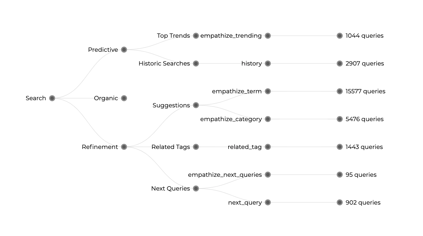
Our problem becomes twofold. On the one hand, we have to describe the different paths and possibilities. On the other hand, we have quantities and magnitudes provided by these metrics, represented by the number of queries. Intuitively one might start with a treemap, distributing the number of queries as a proportion in space of an area containing all possible options.
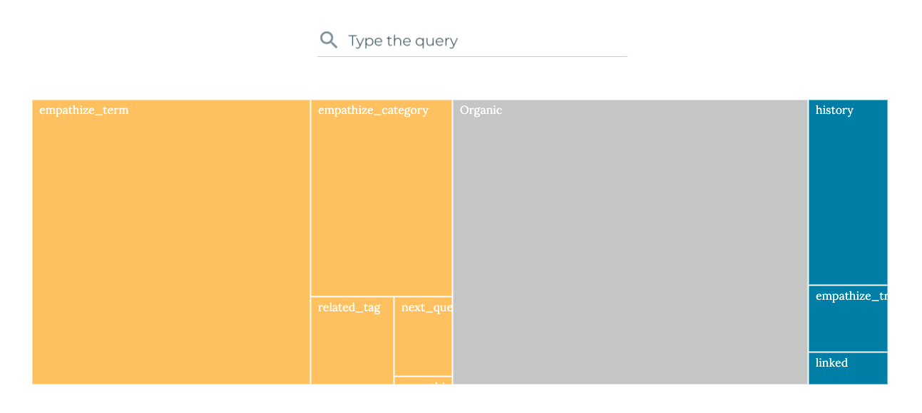
However, when the difference in values spans multiple orders of magnitude, the difference between two of these rectangles could be too high to display information in the tiny frame of the smallest magnitude. Treemaps have become quite popular, lately, and despite their efficiency, they are no longer a surprising data visualisation layout.
Along the traditional data visualisation techniques, stacked dots are also a good alternative to the treemap. Clear and clean layout provides all the information precisely, regarding both the paths and the number of queries.
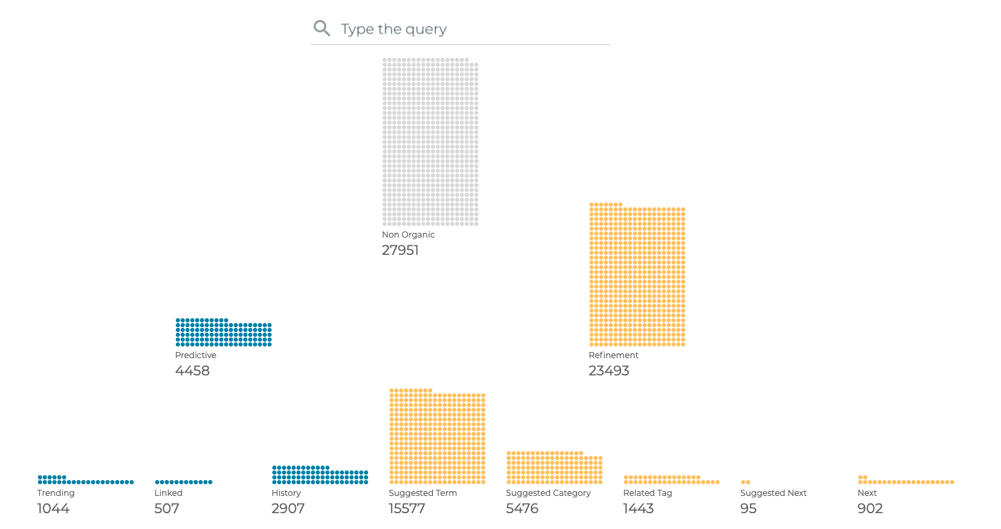
But still, we have the flavour of a traditional dataviz. We might want to push the limits a bit further in order to differentiate our designs from others.
A completely different approach is shown in the figure below. This prototype is based on the treemap, but it uses a circle instead of a rectangle, having circles proportional to the number of queries. This time the different paths are sorted by size. And the whole concept is split into slices, each one corresponding to one path, with some additional shapes that could describe metadata.
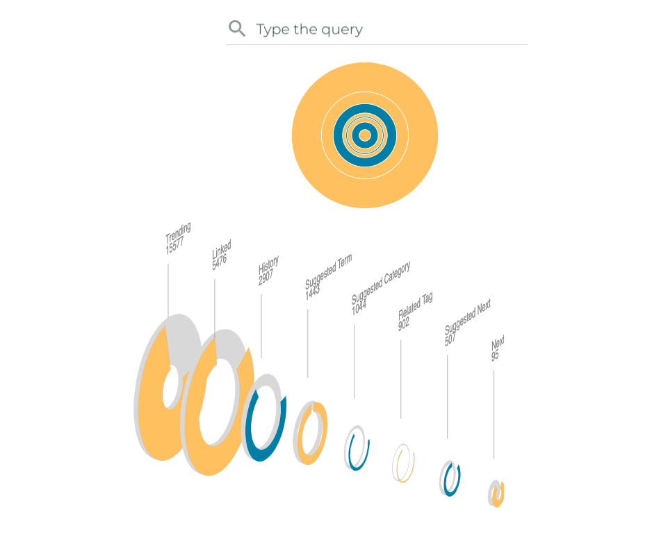
The clear drawback of this design is perspective, which is quite often misleading when it comes to comparing magnitudes and sizes. It seems that this kind of layout might be more suitable for timelines instead of hierarchies such as the one we are trying to solve.
Now, back to the original problem definition, an alternative layout might explicitly resolve what the problem actually is, i.e., paths as trajectories, and volume of queries projected into the volume or width of these trajectories. Here is an example:
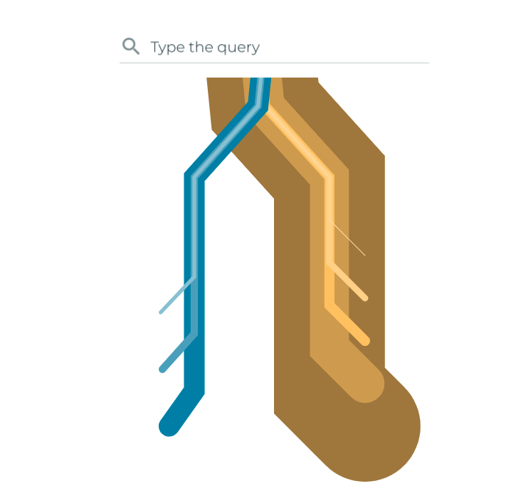
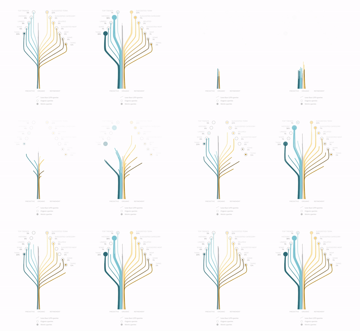
From the search box we have a network of trajectories, a bit like railways or metro/underground lines, the kind of map you see on London’s Tube. Here we have different destinations and the traffic related to each destination. Seduced by this approach, we wondered whether this diagram, put upside down, could become more positive, just like a tree growing from bottom to top.
The next iteration in this design showed the following: two trees side by side to compare, for instance, desktop versus mobile devices' metrics. The tree grows and expands its branches towards each one of the metrics. We differentiate categories by color palettes, but we still have to provide a clearer image of the volume of queries.
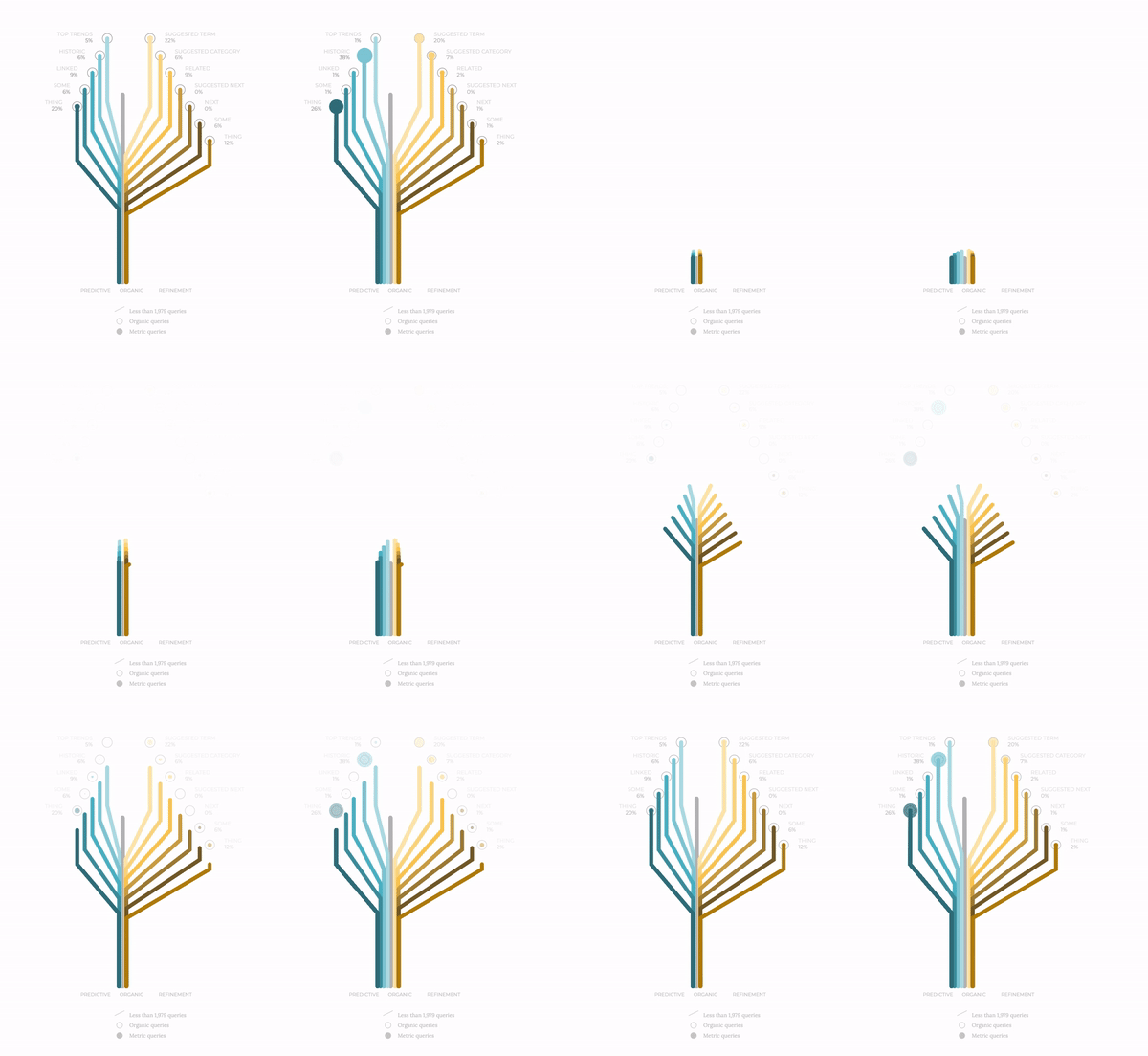
To this end, we perform some subtle yet elegant modifications. First, we assign a branch to each query. In the figure below we show how the mobile stats provide a larger number of queries for certain metrics. Secondly, we draw smooth edges for the branches and make the lines thinner to describe a more delicate layout. Finally, we assign a unique speed to each one of the branches, making the whole concept more alive in all senses, creating a living creature far from the original mechanical railway idea.

This combination of topography of the different paths, together with biological features on the design, makes this exploratory exercise more satisfying because it is a closer realisation of organic reality. Data visualisation is not only about displaying information but also about engaging with the user and evoking warm feelings of proximity. And empathy.
