On blueprints and details: traditional drawing of small features in data visualisation
Back in 1842, John Herschel invented the blueprint, a highly precise drawing technique at the time that served to accurately lay out engineering plans for industrial and construction purposes.Its distinctive dark blue background soon became a landmark of precision and a cultural icon whenever drawings referred to all necessary details to describe a particular design.
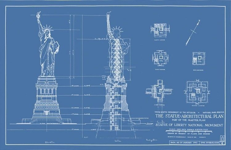
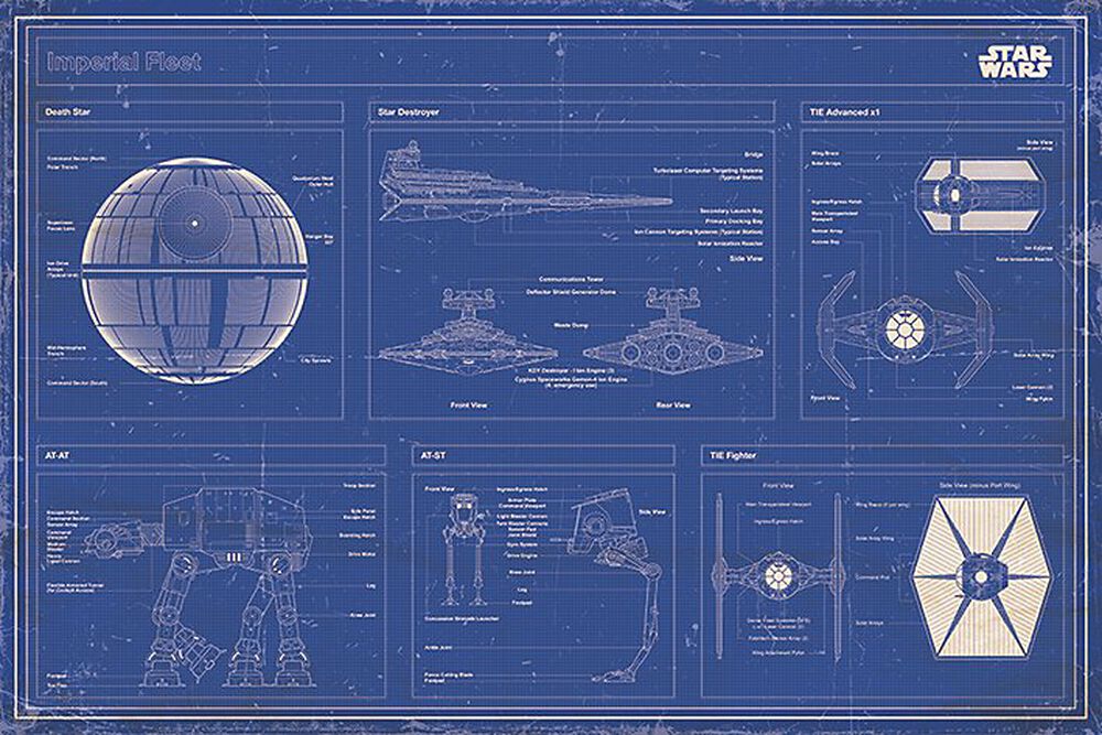
Blueprints address one of the most basic cognitive characteristics of human vision, the fact that small lines and features are better seen on a dark background compared to a clear, white background. This allowed the blueprint to become popular and useful for what it was designed: precision.
This technique can still be used in contemporary data visualisation, aiming at the same principle and evoking the same engineering flavour. Here is an example.
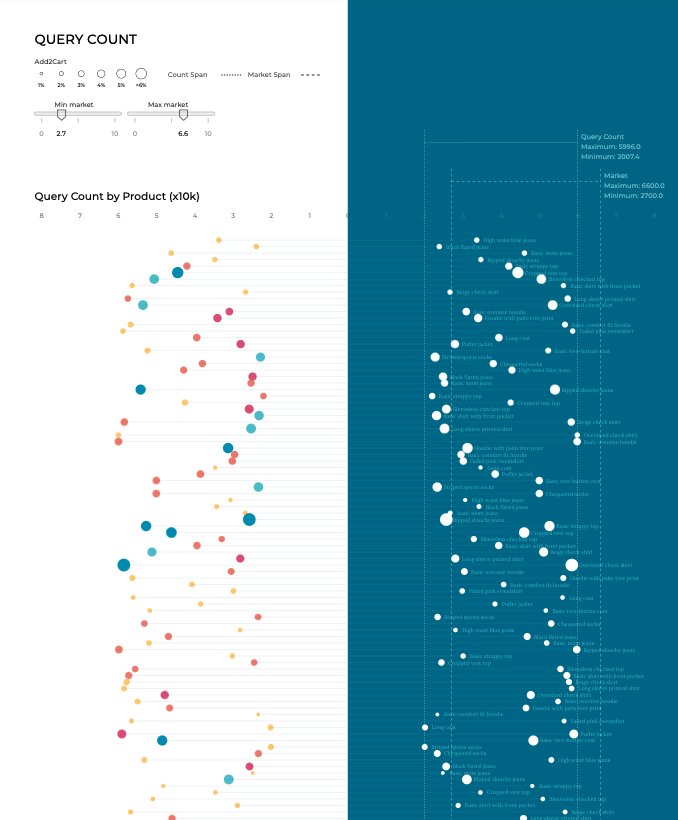
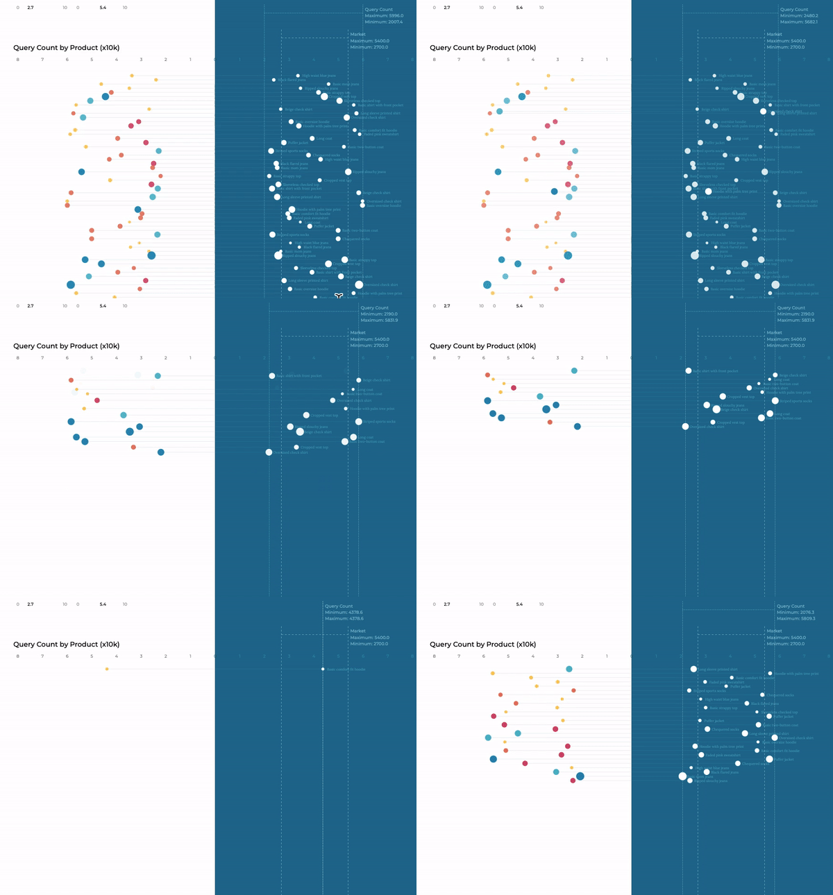
Consider a certain assortment of products, each one with associated queries and related add-to-cart events. Each product belongs in turn to a particular category. We could display the distribution of number of queries together with the percentage leading to add-to-cart on a vertical axis, an overview that allows us to spot the range in which metrics fall, and the correlation, if any, between products and add-to-cart events.
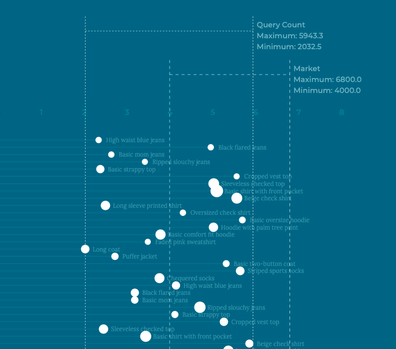
This distribution is mirrored on the right-hand side of the dataviz, mimicking the blueprint. In this part, details about the name of the product, the precise range between the minimum and maximum value of the metric and the range of the minimum and maximum values out there in the market, all frame the former interval.

The diversity of the original layout on the left switches to a monochrome drawing on the right, this time with straight lines and precise numbers. And on top of that there is room for an interactive element to surf through different product categories with smooth transitions, bringing the good old blueprint from the 19th into the 21st century.
