


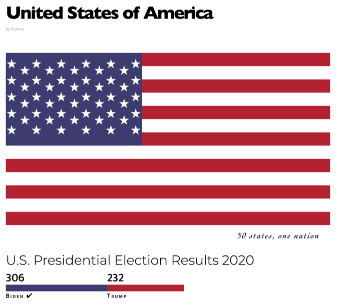
Data Viz: Nothing ventured, nothing gained
“Nothing ventured, nothing gained”: It’s a great proverb to describe data visualisation. Nowadays there are many tools to show information effortlessly, allowing you to have within a few clicks an amazing autogenerated plot with the data. A plot that you might be able to modify a little bit, with the resources that the tool offers you. In consequence, things may not look as you would like, or worse, may not suitably convey necessary information. Yes, the program allows you to see it, but that is different from the feeling of conveying the information.
If you want to communicate your data to someone, you might use a powerful tool called d3.js. I have been using it for a brief time, but I have already been able to verify its potential and how useful it is for displaying information in an unusual way. The only prerequisite that I consider necessary to start is to have a basic knowledge of HTML, CSS and JavaScript to be able to create the schema where your data will be. You could start without it, but surely the path would be harder.
The question now is, where shall I start? It is important to know that you cannot cover everything at once and should not try to. As with everything, you have to follow a learning process: Start with the basics in order to pursue the increasingly complex. The first thing you should know is that d3 is used to create Scalable Vector Graphics elements dynamically, so you could do anything that SVG may include. That is the reason why I started to learn basic shapes like rectangles, lines or text. It is true that I decided to explore further, to learn how to create more complex shapes like stars, but I did not try to fully understand how they worked at that time. I did that later. This was an initial-contact exercise. I had no data as such to show, but I had to learn the basic functionality of the tool to be able to display my information later.
Later on, I kept trying to learn new elements to incorporate into my datavizes, at the same time I was trying to find data that I could show in an attractive way. One of the visualisations that I made shows information related to tweets from various celebrities, revealing how their interactions or sources varied with the passing of days. A big challenge that I had to face with this visualisation was to understand how scales and coordinate axes worked. It was difficult for me to understand how to do it, and I was frustrated with not getting the results I wanted. Of course, I kept trying to do it and in the end I succeeded. If you cannot get it right, but you know it can be done with d3, keep going, trying to get what you want. The result will make you proud of yourself and happy that you have kept trying.
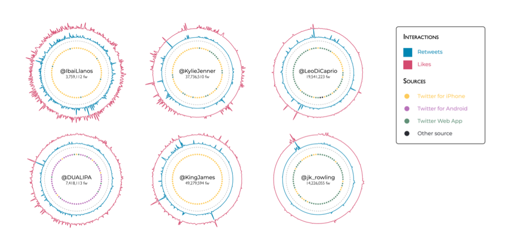
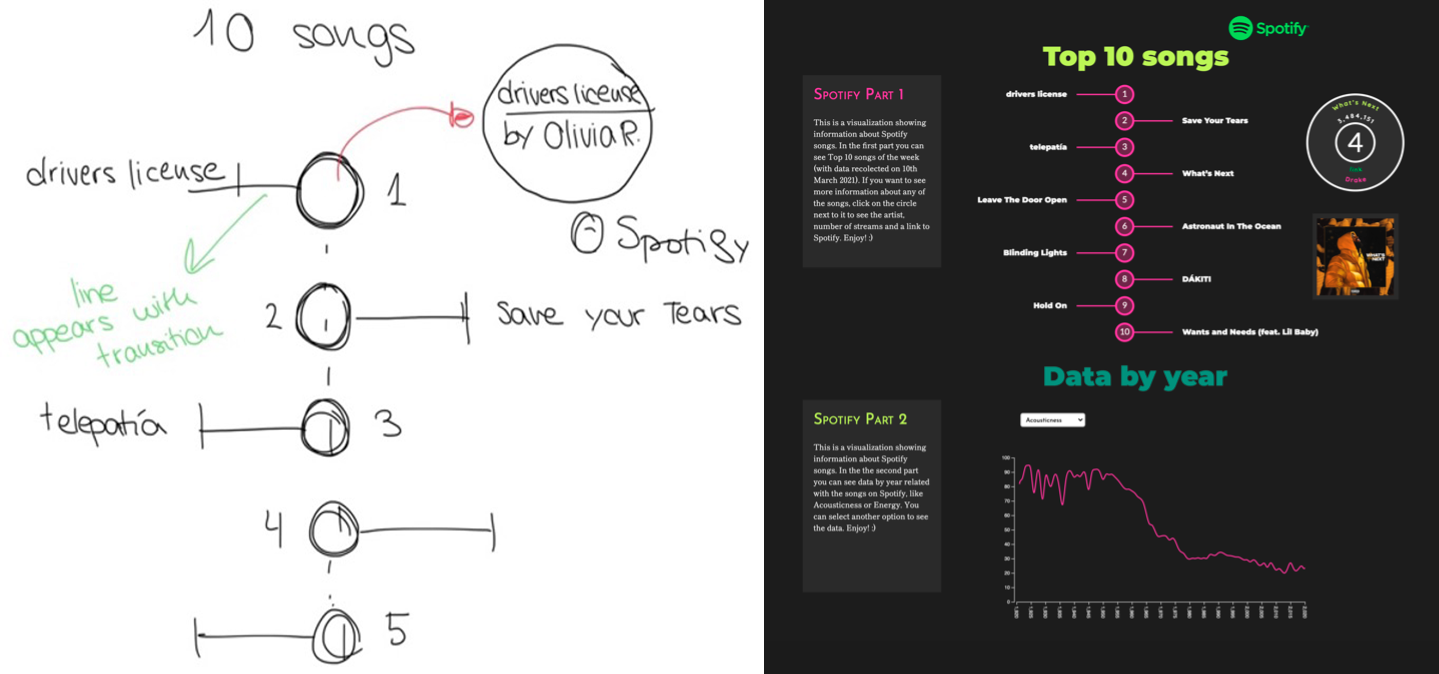
Appropriately for the title quote, it is important to experiment, to try to catch the user’s eye. If it is easy to understand what you want to convey, try new things. As you could see in the previous visualisation, the data is not shown in a linear current graph, but in a circular one. That allows the user to see the information faster and with a change of scene. Coding aside, let’s go back to the beginning with how important it is to convey. Design is a very important part of data visualisation, even more important than the coding part in my opinion. It is important to have a design done before getting down to coding, to have an idea of what you want to do to get a better result and to move faster, so you can decide which diagram might be the best to convey your data, the right colours to attract the user's attention, and so on. There came a point in my learning where I started to focus more on design, trying to do things differently but in a simple way. In the following image, you can see one of my prototypes, and next to it you can see the final design. Yes, at first glance it looks simple, but the information is transmitted correctly without the need to embellish it excessively.
Finally, tell your story. Yes, you have some data that looks visually beautiful. So what? Don't you think it's important to put the user in context to make the visualisation even more attractive? Data visualisations, as the name suggests, are based on data, but if you write interesting information related to it, the impact will be greater. Introduce the users to your article, help them to understand better what they are seeing and take care of them so that they are satisfied.
That’s all, folks! Now you just have to start. Open up to this new world of data visualisation. And remember one of the most important things: nothing ventured, nothing gained.
