Breathing data in a literal sense
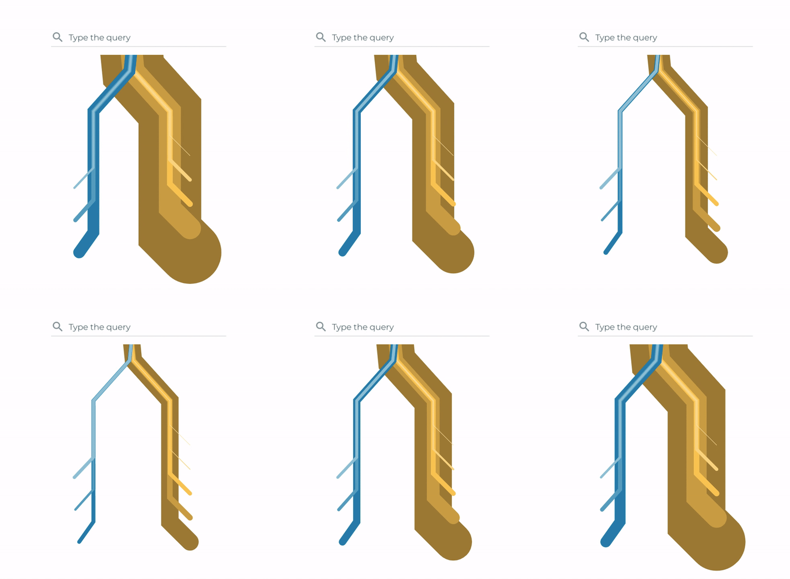
There are several ways in which a data visualisation project can come to life. Features and motion dynamics from living organisms have served as a source of inspiration for the arts, including architecture and industrial design. Shells, spider webs or skeletons found in nature have helped create singular structures that are robust and functional and close to what we identify at a glance as life.
In the data visualisation domain, this is achieved by drawing shapes that may remind us of these structural forms that sculpt living creatures. In fact, graphic design has already inspired us with layouts in which organs were simplified into basic shapes, such as these examples from Paul Tebbott and Studio8Design:
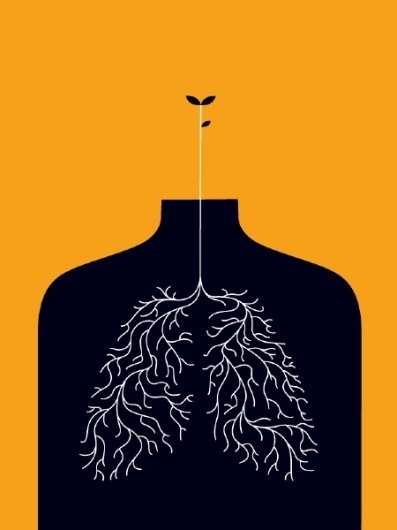
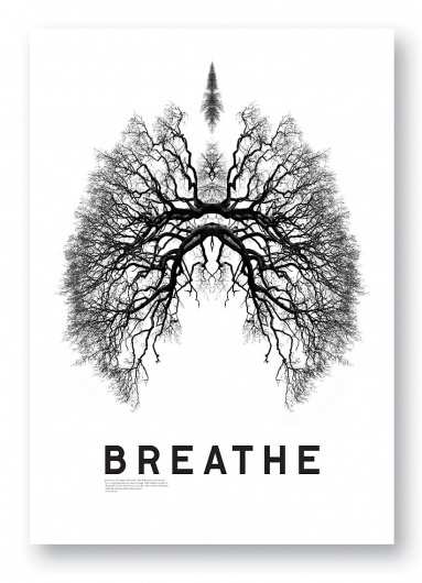
Case in point: Here’s a simple exercise of interpolation, mimicking the motion we might observe with lungs or a heart. We start with a dataviz based on the density of traffic of queries along different paths, depending on the path we choose departing from a search tool, as the one shown in the figure:
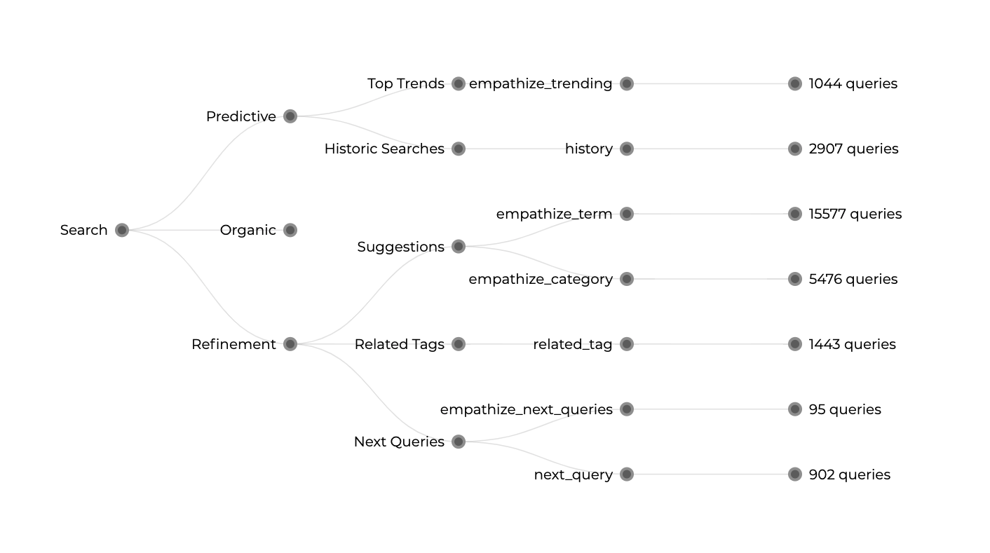
Now let us consider only two of the branches, Predictive and Refinement features, each with sub-branches that enrich the diagram. We display these branches from top to bottom, having a width proportional to the number of queries related to each path.
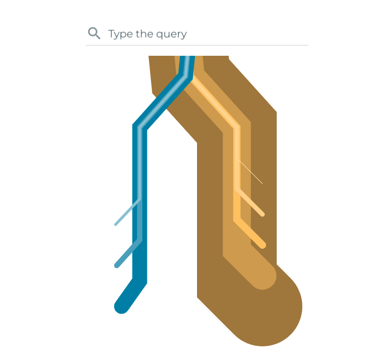
We finally feed the diagram with two different datasets, following desktop- and mobile-related metrics, with a significant shift in magnitude. The plethora of interpolation techniques available in D3.js, when we transition from two different shapes or states, allows us to reproduce that breathing. We are therefore talking about techniques beyond the pure spatial domain. We are talking about time. Large living organisms pump blood and air through their bodies, on a wide spectrum of frequencies, pulses and heartbeats.

Once the transition between these two datasets is in motion, we define two different interpolation functions. For the lungs, a simple linear interpolation and slow transition speed replicate the rhythm familiar from our own breathing. For the heart, we increase the transition speed and apply a circular interpolation function that speeds up the motion on the edges.
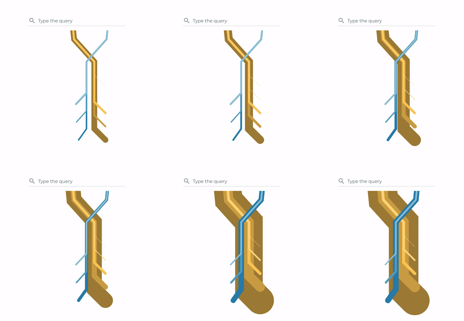
All in all, blood and air pumping can be reduced to their simplest elements in data visualisation using basic D3.js features. And lifelike visualisation makes comparable visualisations within non-biological contexts more vibrant and intuitive.
